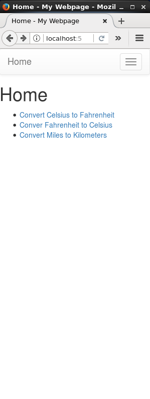
In the part 2 of your lab, we created a simple web app that had 3 functions, allowing a user to convert temperatures (Celsius to Fahrenheit, Fahrenheit to Celsius) and distance (miles to kilometers).
You might have noticed that after you submitted a value to convert, you couldn’t get to the home page or reach any of the other forms to convert different things.
Enter the Navigation Bar
Most websites and web applications are designed so that you can easily get around. An easy to implement good navigation is with a navigation bar. Nav bars allow users to have links that are persistent on the web page so they can quickly get to places on your web app. What’s the point of a great app if you can’t get to the good stuff?
In this part, we will create a nav bar so that users can quickly get around all of the amazing web pages you just created.
Bootstrap: A simple way to get started
We’re going to implement this using a library called Bootstrap. Bootstrap is a free and easy way to get responsive features and styles. An article written by the staff from SPIS 2016 with more information and an example web app can be found here. We will be implementing a more simpler example.
Back to all those templates (layout.html)
Remember all those templates from Part 2? We’re going to use them again.
We want our navigation bar to be present no matter what webpage we are on so that we can always get to where we need to be. Every single one of our webpages files extend layout.html so we want to first add some code in there. We have to get it set up so that our web app knows to go to Bootstrap for information. The new lines of code are long with a lot of links, but don’t feel overwhelmed! Take your time if you’re unsure. Let’s start with our <head> tags, which should currently look something like this:
<!doctype html>
<html>
  <head>
     <link rel="stylesheet" href="{{ url_for('static', filename='style.css') }}">
     <title> {% block title %}{% endblock %} - My Webpage</title>
   </head>
Inside the head tag and before the two lines we currently have, we are going to add some lines of code. First, We need to let the web app know what character encoding standard we are using. UTF-8 (Unicode) covers most of the characters we need. If you want more information, you can check this w3schools article here.
<meta charset="utf-8">
Next, we have a line of code to help with the responsiveness of your web app as you change the size of the window. Note the comment:
   <meta name="viewport" content="width=device-width, initial-scale=1">
    <!-- The above meta tag *must* come first in the head; any other head content must come *after* these tags -->
Finally, we have to code to get access to Bootstrap and being able to use it. With these links, we’ll be able to access Bootstrap’s CSS code to easily style our web app. Feel free to copy and paste the long Bootstrap links into your own file.
  <!-- Bootstrap -->

    <!-- Latest compiled and minified CSS -->
    <link rel="stylesheet" href="https://maxcdn.bootstrapcdn.com/bootstrap/3.3.7/css/bootstrap.min.css" integrity="sha384-BVYiiSIFeK1dGmJRAkycuHAHRg32OmUcww7on3RYdg4Va+PmSTsz/K68vbdEjh4u" crossorigin="anonymous">

  <!-- Optional theme -->
  <link rel="stylesheet" href="https://maxcdn.bootstrapcdn.com/bootstrap/3.3.7/css/bootstrap-theme.min.css" integrity="sha384-rHyoN1iRsVXV4nD0JutlnGaslCJuC7uwjduW9SVrLvRYooPp2bWYgmgJQIXwl/Sp" crossorigin="anonymous">
Your layout.html file should now look a little something like this:
<!doctype html>
<html>
  <head>
     <meta charset="utf-8">
     <meta name="viewport" content="width=device-width, initial-scale=1">
     <!-- The above meta tag *must* come first in the head; any other head content must come *after* these tags -->

     <!-- Bootstrap -->

    <!-- Latest compiled and minified CSS -->
    <link rel="stylesheet" href="https://maxcdn.bootstrapcdn.com/bootstrap/3.3.7/css/bootstrap.min.css" integrity="sha384-BVYiiSIFeK1dGmJRAkycuHAHRg32OmUcww7on3RYdg4Va+PmSTsz/K68vbdEjh4u" crossorigin="anonymous">

    <!-- Optional theme -->
    <link rel="stylesheet" href="https://maxcdn.bootstrapcdn.com/bootstrap/3.3.7/css/bootstrap-theme.min.css" integrity="sha384-rHyoN1iRsVXV4nD0JutlnGaslCJuC7uwjduW9SVrLvRYooPp2bWYgmgJQIXwl/Sp" crossorigin="anonymous">

     <link rel="stylesheet" href="{{ url_for('static', filename='style.css') }}">
     <title> {% block title %}{% endblock %} - My Webpage</title>
   </head>
We’re almost done with layout.html! Now we need include some code inside the body. First, we’ll add this line right underneath the <body> tags:
{% include 'navbar.html' %}
This will ensure that our navbar will appear on every single web page. We’ll create this file in the next step of the lab.
Now, beneath our <div> tags with the block content, we need to include JavaScript plugins so that Bootstrap works correctly. We won’t go into too much detail here, but we will be using jQuery, a JavaScript library. Again, W3 Schools is a great resource and you can play around in your free time with jQuery here.
Your final <body> tags should look a little something like this:
  <body>
    {% include 'navbar.html' %}
    <div id="content">{% block content %}{% endblock %}</div>

    <!-- jQuery (necessary for Bootstrap's JavaScript plugins) -->
    <script src="https://ajax.googleapis.com/ajax/libs/jquery/1.12.4/jquery.min.js"></script>
    <!-- Include all compiled plugins (below), or include individual files as needed -->

    <!-- Latest compiled and minified JavaScript -->
    <script src="https://maxcdn.bootstrapcdn.com/bootstrap/3.3.7/js/bootstrap.min.js" integrity="sha384-Tc5IQib027qvyjSMfHjOMaLkfuWVxZxUPnCJA7l2mCWNIpG9mGCD8wGNIcPD7Txa" crossorigin="anonymous"></script>
  </body>
Congratulations! You finished layout.html! Let’s move on to creating the navigation bar itself.
Creating the acutal navbar
Inside your templates directory, create a file called navbar.html. Remember, this is the file that we had included in the layout.html.
Okay. We’re going to throw a lot of code at you all at once. But don’t worry, we will explain it step-by-step. Look for the html comments that signify different blocks of code. We highly suggest you read the explanation, think about it, and discuss it with your partner before you type or copy-and-paste it in. Your navbar.html should look something like this:
<!-- BLOCK 1 -->
<nav class="navbar navbar-default">
  <div class="container-fluid">

    <!-- BLOCK 2 -->
    <!-- Brand and toggle get grouped for better mobile display -->
    <div class="navbar-header">
      <button type="button" class="navbar-toggle collapsed" data-toggle="collapse" data-target="#bs-example-navbar-collapse-1" aria-expanded="false">
        <span class="sr-only">Toggle navigation</span>
        <span class="icon-bar"></span>
        <span class="icon-bar"></span>
        <span class="icon-bar"></span>
      </button>
      <a class="navbar-brand" href="/">Home</a>
    </div>

    <div class="collapse navbar-collapse" id="bs-example-navbar-collapse-1">

      <!-- BLOCK 3 -->
      <!-- Replace the '#' with links to each of your converters -->
      <ul class="nav navbar-nav">
        <li><a href="/ftoc">F to C</a></li>
        <li><a href="#">C to F</a></li>
        <li><a href="#">Mi to Km</a></li>
      </ul>

    </div><!-- /.navbar-collapse -->
  </div><!-- /.container-fluid -->
</nav>
Block 1
Taking advantage of Bootstrap’s classes, we establish our opening tags for our navbar. <nav class="navbar navbar-default> uses Bootstrap’s standard, default navbar. <div> tags help us organize our web page elements. The class=container-fluid attribute is using Bootstrap to continuously resize our content as we change the size of our browser window.
Block 2
This block of code does a lot of cool things whenever the browser window gets small. It sets it up so that your navbar items will disappear once the window has gotten too small. In its place will be a box with 3 lines that you can click on the show a dropdown meu of the items that disappeared. The home page is not part of the disappearing items because we have set it as the brand. We want this to be persistent because it is useful to always have a quick way to get back to the homepage. The last line before the next block creates a new <div>, marking the start of the items we want to collapse.
Block 3
Block 3 is where you include the actual links to the pages you created in the previous part! Using an unordered list tag (<ul>), we create a list item (<li>) for each of the pages we want to include. Here, replace all the ‘#’ in the references to direct the user to the correct webpage.
Time to test it
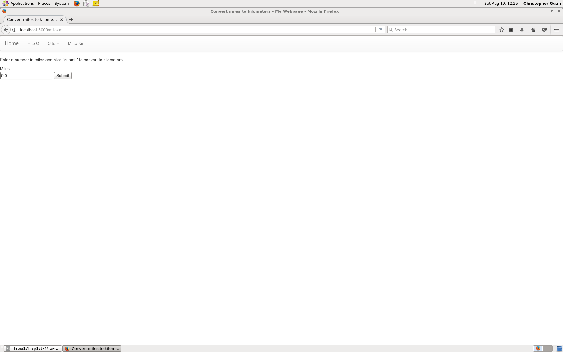
If everything went well, then your webapp should now have a navbar. Return to the level where hello.py is located and run your web app like in the previous parts (python3 hello.py, going to your browser, and using the localhost). Your web app should now look a little something like this:


Don’t forget to save, commit, and push to your Github!
But I want to do even more!
There are a lot more cool things you can do with CSS, Bootstrap, and the navigation bar. If you want to see some more examples, check out the article from SPIS 2016 that was linked previously. There, an example webapp has a navigation bar with dropdown menus and much more. The article has links to the webapp itself as well as the Github repo with all the code. Take a look at the navbar.html file and see if you understand what’s going on! The link to that article can be found again here.
The next lesson
The next lesson is Web Apps Intro (part 3)
In that lesson, you’ll learn how to start hosting your webapps on Heroku so that they can be accessed by anyone anywhere, and not just looking at a web browser on your local computer.